The dictionary definition of contrast is, ‘The state of being strikingly different from something else’.
In photographic terms, contrast can be manipulated in three ways, tonal, with colour or conceptual.
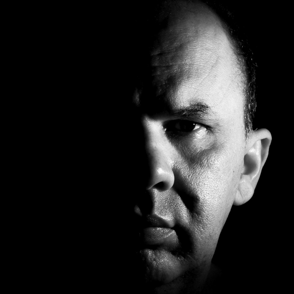
A high tone image mainly includes white and black with few or no middle grey tones. A normal tone image will have elements that are white, some that are black and many middle tones of grey. A low tone image is the one with almost no highlights or shadows; all the tones are very similar one to the other. A good example of tonal contrast would be the use of silhouette.
Colour contrast is used to achieve great compositions. Colours with opposite characteristics, like blue and yellow, contrast strongly when placed together. When two opposing colours are placed together they complement and accentuate the qualities of the other colour. Cold colours and warm colours almost always contrast, light colours contrast against dark ones and bold colours offset weak colours.
Conceptual contrast is abstract and much more subjective than the previous ones because it is based on ideas. Images with this type of contrast have a strong story telling component that usually surprises the viewers.
It consists of putting together things that you don’t expect to see in the same image.
Our challenge for you in this competition is to use contrast to create texture, highlight, shadow, colour and clarity in your images.